Office 2007 has been out for some time now, and most of us have gotten used to the Ribbon, but do you know where the it came from? Why did Microsoft abandon the system of menus and toolbars they had used for so long? Who decided that some command buttons on the Ribbon should be larger than others or in what order they should appear? Why did headers and footers move from the View menu?
Whether you love or hate the Ribbon as part of Microsoft’s
Fluent User Interface, the story about how it came to be is quite interesting.
The Problem
The interface Microsoft had been using from the start had become impossible. When Word 1.0 shipped in 1989 with only two toolbars and five items on the Format menu, the user interface worked rather well.

As later versions were released with all their added features, the user interface became much too complex to navigate efficiently. By the time Word 2003 was released, it had morphed into a bloated monster with 31 toolbars and 19 task panes (a new user interface component introduced in Word 2000) and menus that extended more than half the length of the screen.

Unless you’d been a Word user from the beginning and learned the new features as they were introduced, the task of trying to figure out how to get work done with Word was daunting, to say the least. (Raise your hand if you are a former WordPerfect user who lived through a migration to Word. Ug. That hurt.)
Microsoft Gets a Clue
Microsoft began to realize that their problem was not only usability, but user emotions. After reviewing over 10,000 hours of video of people using Office to find out how people felt when they used it, developers learned that users had lost their “sense of mastery.” A sense of mastery is a feeling that you know what a program is capable of. It’s feeling competent that even if you don’t know every feature, you could figure it out. People didn’t know where to look for features because there were too many places to search. Is it on a toolbar, buried on the third level of some menu, in a task pane, etc.? There was no way to know except trial and error. So, Microsoft tried to make people happier using Office by making it better.
Working Toward a Solution
The first step to a better understanding of how to solve the problem of the now unworkable user interface, was the creation of the
Customer Experience Improvement Program. This program gathered data about how people really used applications, not how developers thought they should use them. Through the CEIP, Microsoft collected over 3 billion sessions of data from Office users while they worked and used this data to redesign the user interface.
When I first began exploring Word 2007, I was delighted to find that headers and footers were moved from the View menu to the Insert tab on the Ribbon. After researching the design of the Office 2007 interface, I learned headers and footers could have easily ended up on the Page Layout tab. It turns out that 50% of testers thought headers and footers were something to insert and the other half thought they were a page property.
After going through several prototypes for the new user interface and settling on the Ribbon concept, Microsoft also did research to determine how the 1,000+ commands should be grouped and where they should appear. They used their CEIP data to analyze how people use things together and in what order, and then grouped those commands together on a tab. Developers learned that the most commonly used feature of Word, Excel and PowerPoint was Paste. No wonder it’s the very first button on the Ribbon!
Another factor in the user interface was deciding how large to make the command buttons.
Fitt’s law is a model of human movement which says: The
farther away a target is, the longer it takes to acquire it with the mouse, and the
smaller a target is, the longer it takes to acquire it with the mouse. For example, a large button far from the cursor is easy to hit. Just toss your mouse pointer in the general direction and you’ve got it. By the same token, a scooch is all you need to select a small button near the mouse pointer.
You can see this in action when you look at the Page Layout tab and notice that the Margins command button is large while the Orientation and Size command buttons are small. Most people change margins more often than paper size or orientation. I’m a bit mystified, though, about why the Themes command button is large and appears first on the Page Layout tab. Who uses Themes that frequently? Maybe Microsoft just wanted us to think the feature was of high value. “Gee, if it’s important enough to be the first button, maybe I’m a loser if I don’t use it?”
Did They Get It Right?
So, after years of research, user feedback, and development, we ended up with the Ribbon. I think it's a step in the right direction, but I think it could stand some improvement. I'm used to it now, but I still get frustrated. For example, it bugs me that I have to click in a table before I can see the Design and Layout tabs. Even though I need to be in a table to use the commands on these tabs, for some reason I want to
see them before I decide to use one.
If you’ve got 90 minutes to kill and would like to hear the whole story about how the Ribbon was developed, including seeing some fun screenshots of past versions, prototypes and testing data (the eye-tracking simulation is hysterical), check out the 2008 MIX conference
presentation by Jensen Harris, Group Program Manager of the Microsoft Office User Experience Team. It’s pretty entertaining.
Oh, by the way, did you know Word 2010 will be released soon? It still has a Ribbon, but at least in the beta, the Office button (a.k.a. “Office Pizza”) is gone. Yay!
If you have comments about this article, I'd love to hear from you. Please also send your Word questions to me at
wordtrainingandtips@gmail.com.


 How would you go about correcting what appears to be irregular alignment of centered text?




 Pressing F8 twice selects the current word. Press F8 again to select the current sentence, once more to select the current paragraph, and once again to select the current section. One more time selects the entire document. If you’ve gone too far with this, just press Shift + F8 to step back a level (i.e. from selecting the paragraph to selecting the current sentence.)
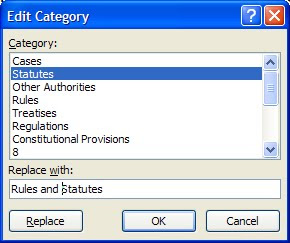
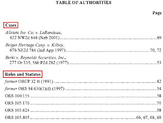
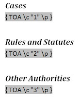
 In the background, Word has assigned numbers to the categories, using the order in which they appear in the Category list. For example, in the example above, Cases is category 1, Statutes is category 2 and Other Authorities is category 3.



 So, what’s the big deal? They still look pretty good, right? The trouble comes when you need to modify the document. Let’s say you want to add new, numbered paragraphs. Press Enter after the first paragraph, and you get a new numbered paragraph with the proper indent. But, do so after the second paragraph and you get no number and the text begins at the margin with no indent. Whaaaa?

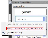
 The concept is that, by placing commands near the mouse pointer, they are easier to access. Great idea in theory. In real life, it’s a pain, at least in this instance.

_593.jpg)
