Change Case - Shift + F3
Changing the case of text you’ve already typed can be time consuming. For example, you may decide that a heading in your document should use “title case” instead of all uppercase. If you have quick fingers, it might seem easiest to just retype the heading in the proper case, rather than fix each word’s capitalization.
The Word 2003 and 2007 the Change Case feature is accessed with Shift + F3 and that lets you toggle among capitalization options:
· Sentence case
· Lowercase
· Uppercase
· Capitalize Each Word (called Title Case in Word 2003)
When one or more full sentences are selected, pressing Shift + F3 will toggle among Upper, Lower, and Sentence case. When a partial sentence is selected (no punctuation mark), Shift + F3 will toggle among Upper, Lower and Capitalize Each Word/Title Case.
Friday, February 26, 2010
Which of These is Not Like the Other?
This article applies to both Word 2003 and Word 2007.
Text in Word documents can look the same, but actually be formatted with different fonts, indents, paragraph spacing, etc. For example, check out the two, seemingly similar paragraphs below. (You’ll have to take my word for it, at least for now, that they are formatted differently.)
Still, it gets even better.
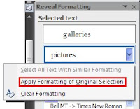
Once you’ve determined that two blocks of text are indeed different, you can quickly make them the same. Begin by hovering the mouse pointer over the second Selected text box to display the menu button. Choose Apply Formatting of Original Selection from the menu to copy the formatting from the first paragraph to the second. Now, the second block of text is formatted identically to the first.
Can you believe I’m giving this stuff away free?
Text in Word documents can look the same, but actually be formatted with different fonts, indents, paragraph spacing, etc. For example, check out the two, seemingly similar paragraphs below. (You’ll have to take my word for it, at least for now, that they are formatted differently.)
 So, what’s the big deal? They still look pretty good, right? The trouble comes when you need to modify the document. Let’s say you want to add new, numbered paragraphs. Press Enter after the first paragraph, and you get a new numbered paragraph with the proper indent. But, do so after the second paragraph and you get no number and the text begins at the margin with no indent. Whaaaa?
If you were to look under the hood to view the formatting used, you’d see that the first paragraph is automatically numbered, and the font is Bell MT. The second paragraph does not use automatic numbering, and the font is Times New Roman.
If this kind of erratic behavior happens in your document, you can troubleshoot the problem and deduce what’s different between two blocks of text using the Reveal Formatting task pane. It’s difficult to access in Word 2007, so I recommend either adding it to the Quick Access Toolbar or use the keyboard shortcut: Shift + F1. In Word 2003, you may choose Reveal Formatting form the Format menu.
Here’s what the Reveal Formatting task pane looks like: The Selected text box shows the text selected in your document or, if no text is selected, the word the insertion point is in. If the insertion point is in a blank paragraph, the box will say “Sample Text.” The Formatting of selected text area shows, by category, the formatting that is applied to the selected text. For example, in the figure above, the font size of the word “snowflakes” is 11 pt and the spacing after is 10 pt. To change any formatting, click the appropriate blue link to open the corresponding dialog box.
But wait, there’s more.
Instead of jumping back and forth in your document, viewing the task pane to see what might be different between two blocks of text, you can make Word automatically compare them, and display the differences in the Reveal Formatting task pane. First, select the first block of text to compare, check the Compare to another selection checkbox. Then select the text to which to compare it.
Here’s the Reveal Formatting task pane comparison of the sample paragraphs above:
Still, it gets even better.
Once you’ve determined that two blocks of text are indeed different, you can quickly make them the same. Begin by hovering the mouse pointer over the second Selected text box to display the menu button. Choose Apply Formatting of Original Selection from the menu to copy the formatting from the first paragraph to the second. Now, the second block of text is formatted identically to the first.

Can you believe I’m giving this stuff away free?
Friday, February 19, 2010
Keyboard Shortcut of the Week
Pete and Repeat - F4
While editing documents, particularly when cleaning up documents created by piecing together bits of text from lots of sources, you probably find it necessary to apply the same formatting in many places throughout the document to make it consistent.
You could create a macro to apply the necessary formatting; assigning a keyboard shortcut to make the process quicker, but there’s an even easier way. Use the “Repeat last action” command with F4.
Begin by applying the formatting to repeat, such as bold, line spacing or indent. Then, navigate to the next block of text to be formatted and press F4 to apply the same formatting to the new text. Repeat the repeating as many times as you like, just be sure not to perform a new action between repeats. Otherwise, you’ll be repeating the new thing. Then you'll have to repeat the whole process.
You can capture several options at once, such as indent, line spacing and widow/orphan control, as long as you do so all in one step, using a dialog box. If you select multiple options via the Ribbon or with keyboard shortcuts, only the last option is captured to be repeated.
If you make a mistake and repeat the last action in the wrong place, just press F4 again to reverse the action. You can also use Undo (Ctrl + Z) without making that “last action” the one that is repeated.
More fun with repeat.
Thursday, February 18, 2010
Why I Hate the Mini Toolbar
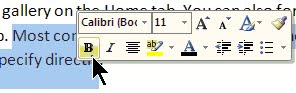
The Mini Toolbar is part of the Microsoft Office 2007 Fluent User Interface. It appears automatically in Word whenever you select text and provides access to common text editing features such as font size, bold and indent.
 The concept is that, by placing commands near the mouse pointer, they are easier to access. Great idea in theory. In real life, it’s a pain, at least in this instance.
I have a couple of issues with the Mini Toolbar. First, it’s in the way. I like to select text as I’m reading. It helps me read fast and keeps me from losing my place if I am interrupted. Kind of like when you read a book and use your finger to skim down a page, but without getting chocolate on the monitor. The trouble is that when I do this, the Mini Toolbar appears and blocks what I’m trying to read. Ditto when I want to drag a block of text to another location in my document. Grrrr.
Second, the commands available on the Mini Toolbar are, to me, an odd collection. For example Underline is missing. Don’t we apply Underline at least as much as Italics? I almost never use Highlight, and why is it necessary to have the Font Size command and the Grow and Shrink Font buttons?
Luckily, Microsoft anticipated my irritation and provided a quick and simple way to disable the Mini Toolbar's annoying automatic appearance. Here’s how:
The concept is that, by placing commands near the mouse pointer, they are easier to access. Great idea in theory. In real life, it’s a pain, at least in this instance.I have a couple of issues with the Mini Toolbar. First, it’s in the way. I like to select text as I’m reading. It helps me read fast and keeps me from losing my place if I am interrupted. Kind of like when you read a book and use your finger to skim down a page, but without getting chocolate on the monitor. The trouble is that when I do this, the Mini Toolbar appears and blocks what I’m trying to read. Ditto when I want to drag a block of text to another location in my document. Grrrr.
Second, the commands available on the Mini Toolbar are, to me, an odd collection. For example Underline is missing. Don’t we apply Underline at least as much as Italics? I almost never use Highlight, and why is it necessary to have the Font Size command and the Grow and Shrink Font buttons?
Luckily, Microsoft anticipated my irritation and provided a quick and simple way to disable the Mini Toolbar's annoying automatic appearance. Here’s how:
- Click the Office button and select Word Options.
- If necessary, select the Popular category from the left-hand pane.
- Uncheck the “Show Mini Toolbar on selection” option, then click OK.
After making this change, the Mini Toolbar is not dead, just sleeping. You can awaken it whenever you like by alternate-clicking anywhere in your document. (This is how the feature works in Outlook, Excel, PowerPoint.)
Wednesday, February 17, 2010
Whose Idea Was the Ribbon?
Office 2007 has been out for some time now, and most of us have gotten used to the Ribbon, but do you know where the it came from? Why did Microsoft abandon the system of menus and toolbars they had used for so long? Who decided that some command buttons on the Ribbon should be larger than others or in what order they should appear? Why did headers and footers move from the View menu?
Whether you love or hate the Ribbon as part of Microsoft’s Fluent User Interface, the story about how it came to be is quite interesting.
The Problem
The interface Microsoft had been using from the start had become impossible. When Word 1.0 shipped in 1989 with only two toolbars and five items on the Format menu, the user interface worked rather well.

As later versions were released with all their added features, the user interface became much too complex to navigate efficiently. By the time Word 2003 was released, it had morphed into a bloated monster with 31 toolbars and 19 task panes (a new user interface component introduced in Word 2000) and menus that extended more than half the length of the screen.

Unless you’d been a Word user from the beginning and learned the new features as they were introduced, the task of trying to figure out how to get work done with Word was daunting, to say the least. (Raise your hand if you are a former WordPerfect user who lived through a migration to Word. Ug. That hurt.)
Microsoft Gets a Clue
Microsoft began to realize that their problem was not only usability, but user emotions. After reviewing over 10,000 hours of video of people using Office to find out how people felt when they used it, developers learned that users had lost their “sense of mastery.” A sense of mastery is a feeling that you know what a program is capable of. It’s feeling competent that even if you don’t know every feature, you could figure it out. People didn’t know where to look for features because there were too many places to search. Is it on a toolbar, buried on the third level of some menu, in a task pane, etc.? There was no way to know except trial and error. So, Microsoft tried to make people happier using Office by making it better.
Working Toward a Solution
The first step to a better understanding of how to solve the problem of the now unworkable user interface, was the creation of the Customer Experience Improvement Program. This program gathered data about how people really used applications, not how developers thought they should use them. Through the CEIP, Microsoft collected over 3 billion sessions of data from Office users while they worked and used this data to redesign the user interface.
When I first began exploring Word 2007, I was delighted to find that headers and footers were moved from the View menu to the Insert tab on the Ribbon. After researching the design of the Office 2007 interface, I learned headers and footers could have easily ended up on the Page Layout tab. It turns out that 50% of testers thought headers and footers were something to insert and the other half thought they were a page property.
After going through several prototypes for the new user interface and settling on the Ribbon concept, Microsoft also did research to determine how the 1,000+ commands should be grouped and where they should appear. They used their CEIP data to analyze how people use things together and in what order, and then grouped those commands together on a tab. Developers learned that the most commonly used feature of Word, Excel and PowerPoint was Paste. No wonder it’s the very first button on the Ribbon!
Another factor in the user interface was deciding how large to make the command buttons. Fitt’s law is a model of human movement which says: The farther away a target is, the longer it takes to acquire it with the mouse, and the smaller a target is, the longer it takes to acquire it with the mouse. For example, a large button far from the cursor is easy to hit. Just toss your mouse pointer in the general direction and you’ve got it. By the same token, a scooch is all you need to select a small button near the mouse pointer.
You can see this in action when you look at the Page Layout tab and notice that the Margins command button is large while the Orientation and Size command buttons are small. Most people change margins more often than paper size or orientation. I’m a bit mystified, though, about why the Themes command button is large and appears first on the Page Layout tab. Who uses Themes that frequently? Maybe Microsoft just wanted us to think the feature was of high value. “Gee, if it’s important enough to be the first button, maybe I’m a loser if I don’t use it?”
Did They Get It Right?
So, after years of research, user feedback, and development, we ended up with the Ribbon. I think it's a step in the right direction, but I think it could stand some improvement. I'm used to it now, but I still get frustrated. For example, it bugs me that I have to click in a table before I can see the Design and Layout tabs. Even though I need to be in a table to use the commands on these tabs, for some reason I want to see them before I decide to use one.
If you’ve got 90 minutes to kill and would like to hear the whole story about how the Ribbon was developed, including seeing some fun screenshots of past versions, prototypes and testing data (the eye-tracking simulation is hysterical), check out the 2008 MIX conference presentation by Jensen Harris, Group Program Manager of the Microsoft Office User Experience Team. It’s pretty entertaining.
Oh, by the way, did you know Word 2010 will be released soon? It still has a Ribbon, but at least in the beta, the Office button (a.k.a. “Office Pizza”) is gone. Yay!
If you have comments about this article, I'd love to hear from you. Please also send your Word questions to me at wordtrainingandtips@gmail.com.
Subscribe to:
Comments (Atom)
_593.jpg)
